Wednesday 3 December 2014

The photography as Document


This was a talk about photography and the feeling of the images presented to us through time, we looked at images taken during the great depression. We analysed what they said and what feelings they presented, mainly talking what they were taken for and what people felt towards pictures being taken of them especially during the great depression.

Bandits' Roost, 59 1 2 Mulberry Street by Jacob August Riis


Tuesday 2 December 2014

Advertising

Often considered as a tool used by capitalism to change established values within society.

Also considered influential in changing our perception and what we may need and want.

No short term effect specific to product.

Modifies us over a long period of time.

Barbara Kruger - "I shop therefore I am" 1987

Often accused to explore sexism treating people as cultural stereotypes of their sex.

 This lecture was a summary of how people are generally perceived in advertisement through sexism, stereotypes and sometimes racially. Talked about sex selling the advertisement, "Does a naked picture of a women sell ?" this is what we thought about and how it attracts the audience to take an interest in the advertisement and the product being sold through imagery and sometimes text, how effective does it make it and does it give the image any justice.    


Barbara Kruger -
"I shop therefore I am"
1987

Gender

Carolee Schneeman, interior Scroll


A talk about gender and how this factor can be perceived in media, this was mainly focused on women and how they perceived themselves and the stereotypes that come out of it when men develop a depicted image of women but of a negative and sexual sense. We then went on to discover that women also develop themselves in a negative light as they feel it is a strong way of presenting themselves especially coming from them.


Nickolay Lamm - Barbie

This focuses on Barbie as a doll being slim and fine in body, did a reality version to show how  different women in imagination to reality.


Tuesday 25 November 2014

Propaganda


This session was a talk based on propaganda and how it is seen with in societies over time, especially during the world war, It can be seen in entertainment, News papers etc. Propaganda meaning-
" information, especially of biased or misleading nature, used to promote a political cause or point of view". 


This is an animation made by disney we watched in relation into propaganda and relates to the stereotypical images painted of other races e.g. "japanese," and the way they saw the war in general, when you watch this it paints an image in your head of what they want you to see and not what you should see.

If they put an article of a french man and dressed him up in a black french hat and blue and white striped top, you would then think that all people in france look like that because the news brain washes you into believing so because you believe all the propaganda in a news paper is truthful.

Wednesday 12 November 2014

Chronologies: communication and mass media


The talk was mainly about the visuals graphics possesses and how using graphics on a image changes its appearance and is given a meaning and purpose. There was a comparison between graphics and other artist precessions and how they either feed into graphics and how graphics is a very young profession in art history, the creator of the word "Graphic Design" was William Addison Dwiggins.

IBM Graphic Type by Paul Rand


Wednesday 5 November 2014

Pictures at work


To days session was all about how we see pictures and what our first impressions can be, we were looking at stepping into a mind of an illustrator and thinking about the a way we as artist perceive the word "illustration" we looked at illustrators and ancient sayings e.g (Hermeniatics) - "We weren't remote witnesses, we were apart of the world we are analysing." We need to always engage with the things the world has to offer to understand and build our knowledge by reading, talking and engaging.

Adrian Tomine (New Yorker Magazine cover) 


Tuesday 4 November 2014

Auteurship and the avantgarde


Notes on Auteurship and the avantgarde, "Auteur" which is Author in french this was a talk about authors and how they edit films, there perceptions on filming and what they do on a whole, what are peoples perceptions on certain films and why they feel that way. We looked at at a trailer for Jason And The Argonauts, we looked at how they have developed ideas and techniques through time. The trailer talked about a animation technique called Dynamation which is a technique used to give film colour and brightness. Movements of unreal characters more interesting e.g. Seventh voyage of Sinbad. We all later had an opinionated discussion on how HollyWood movies are perceived and what really attracts people to see the movie e.g. "having a book relating to the film so they want to see if the movie is like the book".


Wednesday 29 October 2014

Level 4 lecture programme Chronologies of print

This lecture was purely about printing and its origination. We talked about how it developed in time and how printing is seen world wide, we also looked at the passing on of a message through different people and how everyone would receive that message. The questions were would the message die out or would it not make it through its whole target audience ? We looked at Andre The Giant the WWE wrestler and how his face has influenced a new era of type due his loss of a major wrestling match in wrestling history. Andre's face is every where due to the regular use his face by Shepard Farey and his promotion graffiti/prints. The main question of print, how did it get to where it was and how far back did it through time, cave paintings ?

e.g.


Tuesday 21 October 2014

Seminar 1 Animations What is a genre ?


These are current examples of the Animations we looked at as part of the talk for understanding.

Notes from seminar 1 "what is a genre ?", we talked about the basic categorising of films and why they are given a set type of category. Why are films easily recognised in content e.g. "Horror" would feature a lot of blood, fear, threat, blood and gore etc, we categories these types of films based on what they feature. Main problem with genres is that it could be categorised for anything like music which also features genres e.g. Rap, Rock, Jazz etc so this could also be confused with the meaning genres an its meaning. Genres are a statement of categorisation that is not really obvious because when it is referred to it could mean anything, because it does not stand for one meaning alone, it was considered by others as confusing and indirect, but to some it becomes very natural and instantly recognisable to be a label for a form of music, movie or type of something. Another point that was later recognised in the session it that genres can collaborate with one another and can be fused whether it is in music or a film e.g. Scifi/Horror, Aliens is a prime example of a dark but unnatural theme based movie so it possesses two aspect of specific genres.

Seminar 1 notes What is a genre ?


We talked about genres and tried to dig deeper in to the meaning, I have looked at various examples and watched related movies linked to a certain genre to distinguish the differences and to grasp that a genre is and why they are formulated whilst questioning its existence in relation to art, animation, films and movies.

Wednesday 15 October 2014

Context of practice 2 (A history of type)


Notes from contextual practice 2 (A history of type). A lecture on type and the creators, various fonts were investigated and we learnt about why the fonts were created e.g. Arial being a recreated copy of Helvetica font by Windows, comic sans was also known to be another creation by windows. e.g. creator of a type font called "Argus" was "Rudy Vanderlans", Type is also known to be culturally important to everything you do in life to do with writing and structure. Type goes way back and we went back in time to explore how it evolved and became an important tool in our lives, that varies in styles due to its multiple creators.

"Argus Rudy Vanderlans font"


This 2D animation was developed by Ersatz in 1961 and is called "Zagred film" if focus on a square shaped man that lives alone in a world of shaped objects that are easy inflated with a puff of air. He is feeling lonely so he decides to inflated himself a female soul mate, but the plan back fires and she is not really interested in him because of his character and physical well being. The whole story is based on the main character chasing after his female companion to later find out she is no longer interested in him, so he deflates her back to her original shape. I think this animation talks about men in general and their desires and needs, men when alone can feel depressed, especially when we have object objects to surround us but no companion and when we see a woman, we are physically attracted to her by her appearance, personality and will do anything to impress her at all costs e.g. flowers, dinner etc. This just focuses on a mans way of living and how sometimes he can be mis lead by his lust for love. The moral of this animation should be, "There is plenty fish in the sea", which means if your looking your looking for a woman, don't just focus on one, if it doesn't work out between you and one woman you can always find another that understands you in relation.

Tuesday 14 October 2014

9/11 (Coup) cover sample


This cover was designed before the 9/11 incident in America the year November 6, 2001 is very badly designed and can almost be seen as offensive to some because of the imagery almost identical to that of the actual 9/11. Explosion was classed as accurate and identical to The album cover, the only difference was that the Album cover was created before the actual event took place and almost looks very identical to the real thing which said to be coincidental and was clearly stated in the seminar, someone stated that "it almost feels like the people who created the cover planned the whole thing".

9/11 in american Time magazine when the issue hit media September 31st 2001.

Context of practice seminar


This is "The Hand" created 1965 by Jiri Trnka, this is a very dark and meaningful stop motion animation that communicates using symbolic icons that are not very obvious to the eye, but possess a hidden message by using darkly coloured hands. The colouring in the background is very grainy, dark and almost resembles the same features as Mark Millers sin city, which also possess a random but hidden meaning. The Hand is mainly about a doll who wants to live his own happy life with in his own home but is sadly bombarded by hands running his house and his life for him. I think Jiri Trnka's story is trying to communicate how mankind from 1965 till to day with in a government is always controlled and told what to do and how they should live their lives by others, especially by people higher up in business e.g. in to days society, our lives and the way we lives revolves around taxes, bills and living space is all governed by the prime minister and the queen as the head of power, we still have our own say of living but there is more power with the prime minister governing us. The hands almost remind me of the prime minister and all the different parties trying to control me alone as one of the citizens living in Britain. This almost reminds me of the say "the puppet master controls all the strings" referring to the higher people in the government as the "puppet masters" and the working class people as the "puppets".


Wednesday 8 October 2014

Context of practice 1 (lecture 2) visual literacy


These symbols are basically the same thing just with one colour that separates them both and thats the red and the green. One is the symbol of a country (switzerland, red and white) and the other is a medical symbol (First aid, green and white).

Today in contextual studies we talked about the meaning of visual literacy, what it means to the world in general and how we perceive visual communicative object or images. We solve problems of communication through type image or motion, we are generally looking at symbols everyday that cross over from one another with various similarities e.g. English flag and Denmark flag feature the same aspects of design with cross and chosen colours of red and white the only difference is that they are in reverse. We were given a talk through of how we see symbols because of colour and shapes e.g. the colour blue being for men and pink being seen as a feminine colour for women, there for being associated with females. Questions always come to mind like why we see photos graphs as real images, "is a photograph of an apple a photo of a real apple, no because it is designed to look like a real apple that is seen ideally to the eye, it may look to perfect to be an apple because of the amount of work gone into editing it neatly. It is our job to communicate through imagery to our audiences so everything is understandable to our audience, because it is a quicker way of understanding something and they always say a picture paints a thousand words, why?, who?, how?, what? and where?

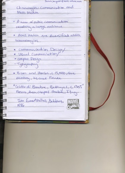
Notes from context of practice (lecture 2) visual literacy