Thursday, 22 December 2016
Poster for Animation
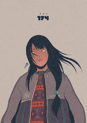
This are just promotional posters for my animation, I did these in a variety of different colours to give them a psychedelic feel to them, this was to reflect the content of my animation and a symbol to its weirdness.
Primary Research into Illustrators
https://www.instagram.com/wizzadaking/?hl=en
(Columbia) Wizzadaking Quotes:
"My art style was inspired by semi realistic anime/mangas because it looks mature and I can give a complex story, and Japanese culture, mostly Chanbara movies and Ukiyo art."
https://www.instagram.com/dirtyrobot/?hl=en
(Japan) DirtyRobot Quotes:
"My drawing has changed so many times over the years and I guess it will continue to do so as I keep drawing and evolving as an artist and person."
"Personally my fav colours are blue and black however, for my work anything goes depending on the image. I tend to stick with limited colour palettes as well."
"I never try to draw any style other than what I feel is true to me. Being in japan I can see how far left my work actually is in comparison to anime."
https://www.instagram.com/199hates/?hl=en
(Argentina) 199Xmau Quotes:
"I like the red color, but all the colors are subjectives."
"I like the Japanese world, the traditional stuffs and ornaments."
"I'm attracted to the design of Japanese stuffs."
"And on the other side I like gangs, groups, urban cultures."
For my primary research I have interviewed a few Illustration artists who are very similar in the way the represent their work they all take a like in Japanese and Urban culture, this is shown in their work and the colours in which they use are completely different based on their own taste, the quotes above are how they felt about their work and the way they believe it represents.
The reason for picking these artists is not just at random, it is because they have the same likes I have in relation to Japanese and Urban culture, I have always tried to find artists out in the open which combine these two different cultures. Its very rare, but I hope to see more artist working like this in the future.
The artist are also from different parts because I didn't want to stay local, I feel it would be better to get the opinions of the people who live across in other countries because people around the world have different perception about matters like colours and the way images are represented.
E.g. “Black is the colour of mourning and death in industrialised west, whereas in China and India it is white”
(Dabner, D., Calvert, S. and Casey, A. (2010) page 32) Manly animation (cartoon Hangover)
This is an animation called Manly by Jesse Moynihan the character and concept designer for adventure time. I have been using this for inspiration because I wanted to create and animation which was fun and colourful just like this, I watched this again and took reference from some of the drawn landscapes and characters to help influence my final animation. The main focus was the bright colours used and the simple character design, I didn't want to over complicate anything, keeping it as simple as possible was the main objective so that it was completable in the time given.
The main things I like about Manly is the character design and the landscapes. The landscapes are simple line drawings but it is detailed brush strokes to give the designs more detailed and depth.
Final Animation
This is the final out come of my animation, I have made two versions of my animation both in colour and black and white this is to show how colour can have impact on how an animation feels and different opinions or perceptions people might have towards the use of colour.
I chose the colours like e.g. yellow and pink to make this animation feel positive in its representation, before going into production, for research I have looked at shade, Tints, complementary, primary, secondary and tertiary colours to build and understand of what colours stand out and strongly represented the feelings I needed. Lighter and brighter colours are said to be softer on the eye and are seen as very positive colours so I decided to use colours along these lines.
The whole idea behind the plot is about a girl who is using a virtual head set to experience an usual world called Hue Island with both wacky and psychedelic colours to symbolise the usual and weird features of this world, There are also odd features added like hovering land to help portray that feeling, but I feel that the colours already give the animation a really strange feeling, its my way of experimenting because it is easy to give this animation ordinary colours, but I wanted to make it fun, unusual and exciting by adding features you don't see everyday with the addition of odd bright colours.
I stuck to a colour scheme to help guide me through my creative process, so I didn't lose my rhythm when drawing. The use of shade colours was just to add detail to certain features e.g. clouds and mountains.
Colours below...
Subscribe to:
Comments (Atom)


