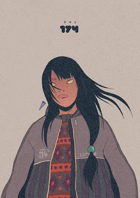
Based on the research in to Aesthetic, which I have provided for my self, I realise that questioning and investigating different peoples beliefs and perceptions of colour are varied from just asking questions like e.g. "What type/style of art do you like ? What are your favourite colours, why and how do they make you feel ?" question like these have provided me with a base of knowledge from a my primary research which I can now compare to my secondary research. For secondary research, looking at various artists and how they work create their pieces based emotion and feeling and this perceived by the viewer based on its aesthetic and colour. I am comparing both the perceptions of the viewer and artist based on the creation of an artists piece to find out how two different messages can come from one picture based on peoples different peoples views, mostly the artist and the view. I will be questioning more artists and art lovers. One big part of generating an understanding of how colour and style is used to communicate is to watch a list of animations and compare both their styles and colours. Reading about both colour and Aesthetic in helping me generate an understanding of where the two concept really come from and how they communicate individually.
I will need to read a few more sources online to find out more about this subject based on a deeper analysis, what I will need to be done is to find out what an animator feels about colour, aesthetic and style, how do they feel it communicates and why.
I need to test out many practical theories by creating visuals people can respond to see what perception and feelings come from looking at an image and why, this idea in it self will later translate it self into my practical but I first want to test this idea with a group of people to see what their responses are to a specific design to show the difference in thing and why this would occur.
Lilfuchs is a big inspiration for this idea because he is an animator which combines both a crazy use of colour and Aesthetic to create mixed feelings. I would want to test the idea of practically combining Aesthetic, colour, style and the idea of a Juxtaposition and combine all ideas together to see how this might change an image in how it might appear. How this will be done is an image will be drawn with a basic use of colour and style as first a first sample, later a second sample will be created with the same image but an addition of another image which opposes the image and the feelings in which it communicates
Things that I will look at involve...
- Yellow – warm, exciting, happy
- Blue – deep, peaceful, supernatural
- Green – peace, stillness, nature
- White – harmony, silence, cleanliness
- Black – grief, dark, unknown
- Red – glowing, confidence, alive
- Orange – radiant, healthy, serious
Sources:
http://files.davidoreilly.com/downloads/BasicAnimationAesthetics.pdf
http://www.mitpressjournals.org/doi/pdf/10.1162/AFAR_a_00239
http://blog.teamtreehouse.com/how-colour-communicates-meaning
https://uk.pinterest.com/kaylalamoreaux/color/
http://www.color-wheel-pro.com/color-meaning.html


