Thursday 22 December 2016

Poster for Animation


This are just promotional posters for my animation, I did these in a variety of different colours to give them a psychedelic feel to them, this was to reflect the content of my animation and a symbol to its weirdness.

Academic Poster


Primary Research into Illustrators

                               
                                https://www.instagram.com/wizzadaking/?hl=en

(Columbia) Wizzadaking Quotes:

"My art style was inspired by semi realistic anime/mangas because it looks mature and I can give a complex story, and Japanese culture, mostly Chanbara movies and Ukiyo art."


                                              https://www.instagram.com/dirtyrobot/?hl=en

(Japan) DirtyRobot Quotes:

"My drawing has changed so many times over the years and I guess it will continue to do so as I keep drawing and evolving as an artist and person."

"Personally my fav colours are blue and black however, for my work anything goes depending on the image. I tend to stick with limited colour palettes as well."

"I never try to draw any style other than what I feel is true to me. Being in japan I can see how far left my work actually is in comparison to anime."


                                              https://www.instagram.com/199hates/?hl=en

(Argentina) 199Xmau Quotes:

"I like the red color, but all the colors are subjectives."

"I like the Japanese world, the traditional stuffs and ornaments."

"I'm attracted to the design of Japanese stuffs."

"And on the other side I like gangs, groups, urban cultures."


For my primary research I have interviewed a few Illustration artists who are very similar in the way the represent their work they all take a like in Japanese and Urban culture, this is shown in their work and the colours in which they use are completely different based on their own taste, the quotes above are how they felt about their work and the way they believe it represents.

The reason for picking these artists is not just at random, it is because they have the same likes I have in relation to Japanese and Urban culture, I have always tried to find artists out in the open which combine these two different cultures. Its very rare, but I hope to see more artist working like this in the future.

The artist are also from different parts because I didn't want to stay local, I feel it would be better to get the opinions of the people who live across in other countries because people around the world have different perception about matters like colours and the way images are represented.

E.g. “Black is the colour of mourning and death in industrialised west, whereas in China and India it is white”
(Dabner, D., Calvert, S. and Casey, A. (2010) page 32)


Manly animation (cartoon Hangover)


This is an animation called Manly by Jesse Moynihan the character and concept designer for adventure time. I have been using this for inspiration because I wanted to create and animation which was fun and colourful just like this, I watched this again and took reference from some of the drawn landscapes and characters to help influence my final animation. The main focus was the bright colours used and the simple character design, I didn't want to over complicate anything, keeping it as simple as possible was the main objective so that it was completable in the time given.

The main things I like about Manly is the character design and the landscapes. The landscapes are simple line drawings but it is detailed brush strokes to give the designs more detailed and depth.   

Final Animation


This is the final out come of my animation, I have made two versions of my animation both in colour and black and white this is to show how colour can have impact on how an animation feels and different opinions or perceptions people might have towards the use of colour.

I chose the colours like e.g. yellow and pink to make this animation feel positive in its representation, before going into production, for research I have looked at shade, Tints, complementary, primary, secondary and tertiary colours to build and understand of what colours stand out and strongly represented the feelings I needed. Lighter and brighter colours are said to be softer on the eye and are seen as very positive colours so I decided to use colours along these lines.

The whole idea behind the plot is about a girl who is using a virtual head set to experience an usual world called Hue Island with both wacky and psychedelic colours to symbolise the usual and weird features of this world, There are also odd features added like hovering land to help portray that feeling, but I feel that the colours already give the animation a really strange feeling, its my way of  experimenting because it is easy to give this animation ordinary colours, but I wanted to make it fun, unusual and exciting by adding features you don't see everyday with the addition of odd bright colours.

I stuck to a colour scheme to help guide me through my creative process, so I didn't lose my rhythm when drawing. The use of shade colours was just to add detail to certain features e.g. clouds and mountains.

Colours below...


Monday 14 November 2016

Mattis Dover

http://mattisdovier.tumblr.com/


Mattis Dovier - Inside from RANDOM ACTS on Vimeo.


MTV ident from Mattis Dovier on Vimeo.

Mattis Dover is an animator I found on Tumbler, he mostly specialises in creating animated gifs, some of his work is short films. the work in which he produces is very dark and pixelated, the pixelated style is his own signature on his work, his footage is very dark and twisted it reminds me a lot of Suehiro Maruo because he is also very interested in representing dark twisted things too using the same negative black and white colour scheme.

Suehiro Maruo


Capital Steez music video and feedback from crit


This is a music video by Capital Steez who died a while back, it was directed and animated team in his memory. whats great about this animation is that it is very colour full and expresses emotions through and different colours, the animated line work is very sketchy and rough. Some images are often repeated purposely to create a cycle, the colours also flash to the beats with in the music to create a link between the sound and the animation so that they work as one. It is very relatable to my research because it focuses on the aesthetic of colour, the way in which the colours are used are very abstract because the images are not completely coloured in properly, they are just scribbled or dotted with particular colours, the outline of the characters are always white, personally I would say they this is so that they are seen a lot easier against the dark blue background.

Tuesday 1 November 2016

Partical experimentation (Document & Reflect)


This is was just a test to animate a potential scene for my final animation, I did not focus on how the character appeared but I was just looking at the scene and colours in general and how they would work as one for the final. my plan is just to do the same scene repeated twice with two different set of colours for the separate animations, just to see how people perceive on image based on the use of colour.  


This is from my ppp3 work, it is a design for a clothing line which I recently did I tied it into my Cop 3 work because it involved an strong use of colours and I wanted to find out what peoples thoughts were on the colours used, I also did this for my short test animation above.

Response 1 - "It makes me feel awake and alert because there is such a clash of colours in the pictures"

Response 2 - "It makes me feel chill... like fresh because of the purple"

Response 3 - "Creeped out lol"

Response 4 - "Makes me feel like I'm tripping on acid & I love the candy in the background it also makes me feel sweet & gives me a warm feeling, since the girl is red, it makes me feel a little dark, if she was purple or baby blue it would make me feel more balanced."

These comments from my primary research above show that the specific meanings for colours can change based on peoples personalities or perceptions of colours. It is almost like the colours don't really have a set meaning, the feelings felt are based of personal experiences because people I have questioned about this issue all have different emotions towards the came colours.

based on Response 4, I personally would not consider the image to be dark apart from the use of red could be seen as aggressive to me, but in places like china who consider red to be a lucky and black as the colour of piece/brightness this image might be seen as a positive representation in the eyes of Chinese people, maybe this is the reason for their choice of a red flag because the red could be considered as lucky and the yellow for the stars is probably a symbol of piece and happiness.

Chinese Flag


Monday 24 October 2016

How colours advance and recede

This is all about colours in both the foreground and background, how they should be arranged is based on their destiny and the way in which they stand out. The stronger and heavier colours sit at the front of the pile and the weaker colours sit at the back. I want to understand how I could possibly apply this concept to my final animation so that my audience concentrate on the most important piece in a scene.


Adobe Kuler colour wheel

This is an app which lets you identify complementary, secondary and primary colours with in an image. the reason for using this is to help me with my particle for my dissertation the main focus is to understand colours, I want to know which colours are strong and stand out in comparison to the ones that don't, I will be experimenting with this to try to understand more about colour blending and the  hues which present a powerful message.


Tuesday 18 October 2016

Pinched Animation Short Film


This is a animation I came across through a music video, the style is very rough and colourful. Story does not make much sense but the reason for my interest in the animation is that this short film is surreal in what it communicates, it isn't your ordinary story, but I would consider it as something interesting because it is nothing I have ever seen before. I am using for inspiration for my test I just looking at the ways it seems strange so that I can apply the same kind of idea to my animations for both cop and personal projects.

Monday 17 October 2016

How reading reflects on my practical investigation

I have been looking at various book sources, not just in animation but other practices and illustration because I believe that all these practices feed into one another based on their idea in representation. I have been looking at illustration books and sites, my research has involved a equal split both in primary and secondary research, I have asked many people questions and have received positive feed back and I also have used secondary research and I tied these in together to help formulate my own opinion and perception of the understanding of aesthetic with in society and how this now translates into animation.

Sources/methods used:


  • sites
  • articles
  • books
  • DVDS/Films 
  • Youtube 
  • questionares 
  • instagram
  • experimenting 

Project planning and time management

For this project I have not got a prototype just yet, but I am working on experimentation and going around asking questions about my chosen subject based on aesthetic, I have received many good answers from people worldwide, so I can use this to help develop my research and final animation. I am currently working on developing another experimentation as a full and animation, my previous animation did not turn out right, so I am working on another piece which works well, I plan to use the same colours from one of my first experimentation pieces on my latest version, the image with in the animation will also be very different because I want to see the effect that this piece has on an audience based on the use of the same colour, but a different style.

I currently write notes and take both my blogging and experimentation in stages, during the week i work on COP3 and the weekends is PPP3 because my personal work is done then so I am giving a lot of my devotion to this project at the moment.


Thursday 13 October 2016

Experimentation part 3

DAY 1

13/10/2016

I am going to make a different animation with the colours of one test images and will see if peoples perceptions change  because of the movement and change of imagery. I will make sure the movement is very communicative and symbolic to specific emotions because It to evoke different responses to my previous images and I want to know how movement effected the character created.


DAY 2

18/10/16

To day has been all about generating a new idea for my experimentation part, I am working on creating a short animation with sound using colours from one of my previous tests. This will be animated on a completely different animation to see if the change of the images have an effect on the colours used, this will need to create a mixed message.


This is the start I have made but I am looking for something which features more of a creative out come, more experimentation and thought is needed. I am thinking of working more with allusions rather simple images like these because they get people thinking a lot more.

Wednesday 12 October 2016

Inside out

 Image result for inside out

Image result for inside out


I watched inside out for ideas on colour communication with in animated visuals, i have now learnt that the visuals are used and colours are used as a symbol of emotion, but the movement helps provide the feel of the character to the viewers because the character as a still image, gives you certain information but not everything. When a character moves you get to understand them better because their in action, when you look at them still you always have to visualise or imagine what they would be like if they could talk and move, I think that watching Inside out has helped to provide that more knowledge about this subject because I have now experienced what is like to feel emotion through colour and style because I have analysed the animation based on the the concepts my dissertation talks about. I personally think the colour representation of the character called fear is wrong because I personally would not associate purple to something as negative because I see as a colour for royalty and power. Dark colours  are the only negatice colours to represent that, maybe grey would have been better for the character because it is very miserable and dull and you could personally say that is what fear is, a hindrance.

Experimentation part 2

DAY 1

12/10/2016

This will involve the same technique as experimentation part one but this will used animation in addition to the colour and style. I want to see what people now feel with the addition of movement and why if their opinions change.

DAY 2

13/10/2016

I have developed the test animation but it could not load up on Instagram because the file was classed as too big for the format. Instagram has been my primary research source for the past few weeks because I have been reaching out to many different people around the world and have been finding out about what colour and style symbolises to them by the feelings they provide. I have made a few test to do with colour and aesthetic by asking various questions and testing this concept out on my illustrations and comparing two different colours on the same image to see what people thought about them. My idea was to carry on yesterdays experimentation part 1 but this time work with animating it to day. But now after some thought I now realise that movement is only significant with in animation if and when the character is changing position and emphasising his or her emotion through body language. The following animation did not do this very well, my idea was to just have the brain floating over the woman's head, but this would not change peoples perceptions of the images because there is no other emotions or any difference between the still image and the short animation because it just feels the same.


Experimentation part 1

For this experimentation I created two separate images on one characters and coloured them differently with a mixture of colours, reason for this was because I wanted to run a primary research test which involved asking questions to various people about what they felt toward both images based on the colours used, I was to surprised to have received such mixed messages from so many people looking at both these images. The red colour was sometimes considered as peaceful and the yellow had been considered to be negative a few times in presentation based on the colour around the brain. my test audience received very different feelings to one another, this process has been very helpful because I have received various ideas in person, I have managed to experience and understand what people really feel and how they are effected by aesthetic. I can now use this information to help my dissertation develop a sense of direction.

e.g. lil.bambi.eyes said:

"1. Energetic, positive, interested"

"2. Angry, disheartened, invaded"

Image 1

Image 2
 

Tuesday 11 October 2016

idea for final animation

The idea for my final animation is to create a animation piece which runs for 30 seconds, this piece will be revolved around the idea of aesthetic and colour as forms of communication. My idea is to create one short music video split into two separate part both 15 seconds each, the first scene will be specific light colours and then it will change half way through from to dark colours. By doing this I want to see how people think or feel when they see and image change state based on the colours and aesthetic.

Colours and feelings


Idea of music for animation

I want to use a song called "Use Ya Mnd (Twentyfourseven)" which is Mndsgn. Reason for picking this song is because it is very up beat and I personally think that this will fit my animation because I am going for a very abstract look and the beat of this music reminds me of something which is very expressive and fragmented.


Monday 10 October 2016

Primary research 199Xmau


I questioned my favourite Illustrator/Animator called 199Xmau about what he thought about colour and what he would consider as inspirations for his style of art, he gave me really straight answers and voiced his genuine opinion on his inspiration and what the reason for creating his pieces. He is a big fan of Akira and Tekkon Kinkreet, a lot of his inspiration for Akira, Tekkon Kinkreet, Japan and Urban culture was reflected in his work. Instantly reminded me of Akira because it featured a symbol relating to the anime which was a sign of admiration along with the style which was abstract similar to Tekkon Kinkreet. He states that he believes that his drawing style is a form of development, 199Xmau does not believe that his style is based on communication, he prefers to say that it is a reflection of his interests.


Primary research into peoples thoughts on colour


 For my Primary research have been asking some of the Instagramers about their personal taste in colours and the emotions feel when looking at particular colours they like. I was surprised to find out that many people had similar tastes in colours but different feelings towards them, I asked round about 30 people the same personally liked asking the different people the same questions because they all had very good knowledge and different opinions based on their experiences. The answers were all very good and demonstrated a clear divide in perception and have been very useful for developing my research.    

Tuesday 4 October 2016

Writing exercise Triangulation of theories 500 words

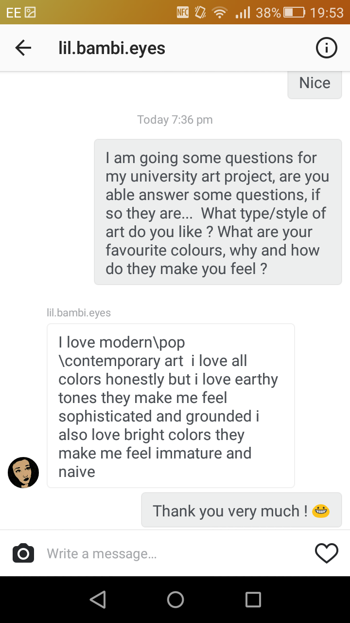
Based on the research in to Aesthetic, which I have provided for my self, I realise that questioning and investigating different peoples beliefs and perceptions of colour are varied from just asking questions like e.g. "What type/style of art do you like ? What are your favourite colours, why and how do they make you feel ?" question like these have provided me with a base of knowledge from a my primary research which I can now compare to my secondary research. For secondary research, looking at various artists and how they work create their pieces based emotion and feeling and this perceived by the viewer based on its aesthetic and colour. I am comparing both the perceptions of the viewer and artist based on the creation of an artists piece to find out how two different messages can come from one picture based on peoples different peoples views, mostly the artist and the view. I will be questioning more artists and art lovers. One big part of generating an understanding of how colour and style is used to communicate is to watch a list of animations and compare both their styles and colours. Reading about both colour and Aesthetic in helping me generate an understanding of where the two concept really come from and how they communicate individually.

I will need to read a few more sources online to find out more about this subject based on a deeper analysis, what I will need to be done is to find out what an animator feels about colour, aesthetic and style, how do they feel it communicates and why.

I need to test out many practical theories by creating visuals people can respond to see what perception and feelings come from looking at an image and why, this idea in it self will later translate it self into my practical but I first want to test this idea with a group of people to see what their responses are to a specific design to show the difference in thing and why this would occur.

Lilfuchs is a big inspiration for this idea because he is an animator which combines both a crazy use of colour and Aesthetic to create mixed feelings. I would want to test the idea of practically combining Aesthetic, colour, style and the idea of a Juxtaposition and combine all ideas together to see how this might change an image in how it might appear. How this will be done is an image will be drawn with a basic use of colour and style as first a first sample, later a second sample will be created with the same image but an addition of another image which opposes the image and the feelings in which it communicates

Things that I will look at involve...
  • Yellow – warm, exciting, happy
  • Blue – deep, peaceful, supernatural
  • Green – peace, stillness, nature
  • White – harmony, silence, cleanliness
  • Black – grief, dark, unknown
  • Red – glowing, confidence, alive
  • Orange – radiant, healthy, serious
Sources:

http://files.davidoreilly.com/downloads/BasicAnimationAesthetics.pdf

http://www.mitpressjournals.org/doi/pdf/10.1162/AFAR_a_00239

http://blog.teamtreehouse.com/how-colour-communicates-meaning

https://uk.pinterest.com/kaylalamoreaux/color/

http://www.color-wheel-pro.com/color-meaning.html


Monday 3 October 2016

5 relevant contextual references

1.) https://prezi.com/8mhioavsqyte/art-communicates/

2.) http://www.incredibleart.org/files/ideas.htm

3.) https://vimeo.com/83516969

4.) http://www.artstudiosandiego.com/brochures/8communicating_with_art.pdf

5.) Key Terms In Philosophy of Art

Presentation on Cop Aesthetic

For my presentation I talked about my chosen idea which was the question about Aesthetic in animation, reason for choosing this was because I am passionate about the aesthetic with in art and I see my self as a visual communicator.

I will be talking about how art visually communicates with an audience based on colour, style and how this idea translates through to animation. There will be a lot of primary questionnaires and surveys so that I can get a real understanding of what people feel and think about art and also how artist work with style and colours as a communication.


Friday 15 July 2016

Website 5 - Illustration

http://www.illustrationweb.com/artists

Illustration is similar to Pinterest in that it functions the same but illustration is focused around one core subject alone which is art, it also has many different artist you can follow. I can use this to most likely find some more artist research and ideas for my up and coming project.


Website 4 - Pinterest

https://uk.pinterest.com

Pinterest is a site which focuses on the general interests of people, you are able to select a category your interested in and images relevant to your selected choice will appear. The reason for using this as a website source is because I find the images that appear when searching the subject of art to be very visual and strong in its representation of what arts all about most images communicate using visuals, colours and lines. I mainly want to use this site because I find it reliable for good idea generation based on the images it provides are varied and you have a choice based on what your looking for.


Monday 11 July 2016

Image 5 - Anna Cattish

Image 4 - Trungles

Image 3 - yusuke nakamura

Image 2 - Jamie Hewlett

Image 1 - Xmau

     
This is art by an illustrator I follow called Xmau. He focuses on creating Korean orientated images which use similar colour themes and follow one consistent pattern, which I my self think is very creative a and amazing in appearance because it gives a for of identity. What I like most is that the colours communicate the same feeling because none of the colours change in any of the piece he does, it reminds me of  Jamie Hewlett's work because it is very expressive and presents unusual, unseen and crazing looking characters. This will prove to be very use full for my art work be cause it will provide me with ideas for my own characters maybe even a particular theme to follow.